1. Taking the First Steps Toward Teaching with Visualization
Julie Himmelberger; Youngjoo Kim; and Christin Monroe
A key tenet in the field of biochemistry is that macromolecular structure determines function. Since the 3-dimensional structure of DNA was first determined in 1953, closely followed by the first structure of a protein in 1957, biochemists have continually pursued the structural determination of a myriad of biological macromolecules, and detailed analysis of these structures helps inform an understanding of function. Now with over 200,000 in the PDB, in addition to more than a million computed models, the catalog of known biological structures is immense. During the past several decades, the strategies for visualizing macromolecules in the classroom have also expanded, from the early days of clay models to the current diverse array of visualization programs, VR, and 3D-printing. With this wealth of information available at our fingertips, it is critically important to educate students as to how to interpret and engage with this information (Goodsell and Jenkinson, 2018).
Nearly every page in a biochemistry textbook includes 2D-representations of biological molecules. Many of these representations are based on known or computed structure models from the PDB, but also include, among others, molecular models, diagrams, metabolic maps, symbolic pathways, and graphs. Textbook illustrations are often carefully designed to highlight specific structural features to support the understanding of concepts through the careful selection of representation, color, orientation, and scale (Schönborn and Anderson, 2006). Furthermore, figure legends often refer the reader to the original source of the structural information, often a PDB ID. It is the role of the instructor to educate students on strategies to thoroughly decode and interpret these figures, which requires a degree of visual literacy that often takes years of scaffolding to fully develop (Beckham et al., 2024). Furthermore, explicit instruction in molecular visualization is a necessary element of a biochemistry curriculum because research shows that students need to be mentally engaged in an active visualization process in order to develop visualization skills (Mayer, 2003). According to Mayer’s theory for multimedia learning, deeper learning takes place when images and words are combined, rather than presented separately, and when the text is presented in a conversational manner. Through the learning process, students should be encouraged to apply metacognitive skills to assess their own understanding. They should ask themselves “do I understand what I am seeing?” By scrutinizing their initial interpretation they can build more powerful mental models and make conceptual connections (Schönborn and Anderson, 2006).
Scaffolding from General to Organic to Biochemistry & Molecular Biology
Scaffolding biomolecular visualization involves building a foundation that begins in general chemistry, deepens in organic chemistry, and advances to the complex structure and function relationships explored in biochemistry. In general chemistry, instruction focuses on helping students understand molecular geometry and the spatial arrangement of atoms. Students should learn to visualize simple molecules in three dimensions. Visualization skills in organic chemistry include recognizing the spatial arrangement of atoms in functional groups, and intermediates and transition states in reaction mechanisms. Significance of stereochemistry should be emphasized.
For example, in an introductory college level chemistry course, students often focus on interpreting chemical formulas and writing balanced equations. At this introductory level, students become familiar with glucose by its chemical formula, C6H12O6. In organic chemistry, the spatial arrangement of the atoms in the molecule becomes a central focus. Students are able to interpret the structure of beta-D-glucose in the chair conformation. Finally, in a biochemistry course, students are taught how to recognize a molecular model of glucose. A summary of this progression is shown in Figure 1.

By the time students reach biochemistry, the visualization skills they developed in general and organic chemistry should enable them to analyze and interpret the macromolecule structures, focusing on how three-dimensional structure determines biological function. Students learn to navigate the macromolecular structures by identifying secondary and tertiary structural elements, exploring active sites and ligand binding pockets, and examining interactions with cofactors or inhibitors. A key skill at this stage is ability to recognize and interpret noncovalent interactions that stabilize macromolecular structures. Throughout the scaffolding, instructors should emphasize continual development of three-dimensional thinking. Using increasingly advanced visualization tools at each stage allows students to build confidence and fluency, preparing them to independently explore the structural basis of biological function in a biochemistry course.
Structure and Function as a Foundational Concept in Biochemistry Education
In 2002, the ASBMB published an undergraduate curriculum framework which emphasizes four foundational concepts: 1. Energy & metabolism, 2. Structure & function, 3. Information storage & transfer, 4. Scientific skills. An understanding of macromolecular structure and function, including how macromolecules interact with each other as well as in their aqueous environment, is a critical component of undergraduate biochemistry education. Students must be taught how to go beyond simply memorizing examples of structure-function relationships (for example, the structure of the heme group in the hydrophobic pocket in myoglobin functions as an oxygen carrier) and be trained how to extract key information from new models or images, while ignoring extraneous information. This procedural knowledge will empower them to be able to critically examine novel biological representations in order to draw their own conclusions.
The ASBMB has established associated learning goals that are classified as either introductory, intermediate, or upper level, for each of the foundational concepts in the framework. Unsurprisingly, learning goals that explicitly require visual literacy are typically classified as intermediate or upper level. One of the learning goals at the intermediate level is the ability to compare and contrast the primary, secondary, tertiary, and quaternary structures of proteins and nucleic acids. Competency requires the ability to integrate the visual understanding of multiple structures and representations in order to draw conclusions.
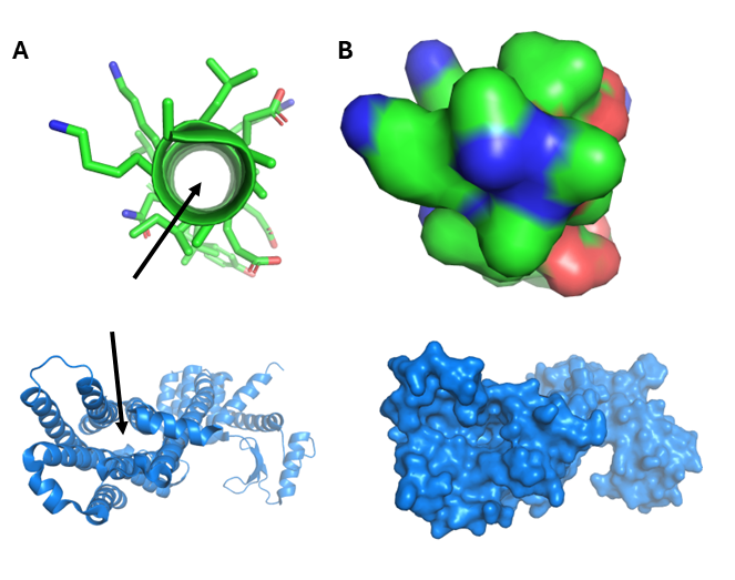
For example, when examining structures that involve both protein and nucleic acid, as seen in the representation of a topoisomerase bound to DNA (Figure 2), depending on the representation, the presence of helices in both the protein component as well as the DNA may not be evident. For example, in Figure 2.A, when the protein (green) is shown as a cartoon representation the alpha-helical secondary structure is evident, whereas the surface representation of the DNA (purple) obscures the DNA double helix, possibly making it unrecognizable to a student. In Figure 2.B. the surface representation of the protein hides the secondary structure, but more accurately represents the encapsulation of the DNA by the protein. In Figure 2.C., the protein is represented as sticks, making a comparison between the helical structures of DNA and protein impossible. Finally, Figure 2.D would be appropriate for students to compare the helical structures of protein alpha-helices and DNA and be able to identify the significantly larger diameter of the DNA double helix.

Conceptual Difficulties in Biomolecular Visualization
In the absence of explicit instruction, students may face conceptual difficulties that impede understanding or even cause misconceptions in visual understanding. If these conceptual difficulties are not recognized and resolved, they can be detrimental to further learning. In the classroom, it is important to challenge students to describe the images that they are viewing in order to identify and correct any misconceptions. One way this can be achieved is by asking students a series of guided questions and allowing them to discover and discuss the information that the image is designed to convey. The commonly used cartoon representation of a protein may suggest that there is significant empty space within a protein, or even in the core of an alpha helix, when in fact, the side chains nearly fully occupy the volume within the protein.
Another conceptual difficulty is that macromolecular structures are static. This is not surprising, due to the motionless nature of most structural representations. Therefore, students need to be taught how to visualize and consider the constant motion and conformational changes that take place in biological systems.
Finally, the use of certain conventions in representations may actually hinder understanding. For example, most textbooks represent carbohydrates as Fischer or Haworth projections, or as simple colored hexagons, making them much more difficult to identify when illustrated as a 3D molecular representation. If proteins are always shown as surface representation, DNA always shown as cartoon helix, students may lack the skills to interpret the complexities of the information.
Designing Accessible Figures: Clarity for All Audiences
Accessible figures are visuals designed to be easily interpreted by the widest possible audience—including those with visual, cognitive, or perceptual differences. While some accessibility features are essential for people with disabilities, they often benefit everyone by improving clarity and reducing confusion.
To make your figures more accessible, focus on three key elements:
- Color-blind-friendly palettes
- Alternative text (alt text) for screen readers
- Scaffolding of information to reduce cognitive overload
Choosing the Right Palette
Commonly used colors like orange, green, pink, and purple can be difficult to differentiate for individuals with red-green color blindness. A yellow-orange-blue-grey palette offers good contrast for most viewers, but those with blue-yellow color blindness (less common) may still struggle.
Why Color Choices Matter
Around 4.5% of the population experiences some form of color blindness, with red-green being the most common type (Birch, 2012). That means if your figures rely on color combinations that are hard to distinguish—such as red vs. green, or orange vs. pink—important information might be lost for a significant portion of your audience.
Even among people with the same type of color vision deficiency, the severity can vary. Therefore, choosing high-contrast, clearly distinguishable colors is key to ensuring your message comes through for everyone.
Tools to Help
Microsoft PowerPoint includes a Color Blindness Checker as part of its accessibility features. This tool helps identify problematic color pairings in your slide decks. Another excellent resource for evaluating color contrast and accessibility is the Coblis Color Blindness Simulator.
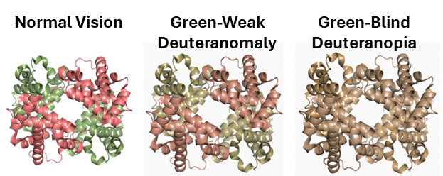
The most common type of color blindness, or color vision deficiency, is deuteranomaly. It is commonly referred to as red-green color blindness because the reduced sensitivity to green light makes it difficult to differentiate shades of pink and green. In Figure 4, the tetrameric structure of hemoglobin is shown with the alpha subunits colored pink and the beta subunits colored green. The shades of pink and green can be easily distinguished by someone with normal vision, however when the Coblis Color Blindness Simulator is applied to the image, the two shades appear nearly indistinguishable to someone with green-blind deuteranopia.
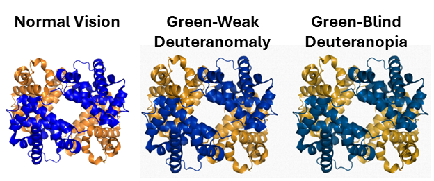
Conversely, in Figure 5, the simulator predicts the blue alpha subunits and orange beta subunits of hemoglobin can be distinguished by someone who is color blind.
Another option is to avoid color entirely. Grayscale is a strong default for maximum accessibility—especially when printing in black-and-white. However, attention must be paid to contrast and shading so that all segments remain visually distinct. In Figure 6, the alpha-subunits of hemoglobin are colored dark grey and the beta-subunits in light grey.

By being intentional in your design choices, you’re not just meeting accessibility standards—you’re improving communication for everyone.
Writing Effective Alt Text: Making Images Meaningful for Everyone
Alternative text (alt text) is a short, descriptive phrase that conveys the essential content of a digital image for those who use screen readers. Alt text is crucial for accessibility—not only for individuals who are blind or have low vision, but also for those with dyslexia or other neurodivergent traits who may prefer auditory processing.
However, writing effective alt text isn’t just about describing what’s in the image—it’s about highlighting what matters.
Key Principles for Writing Alt Text
- Focus on the purpose: What concept or detail do you want the viewer to understand from the image? Your alt text should emphasize these details and not just list visual elements.
- Avoid information overload: While some users benefit from detailed visual descriptions, too much information—especially when read aloud—can overwhelm cognitive load. This is especially important for users who have never had sight and may not have a visual reference framework.
- Tailor it to the educational context: There’s no one-size-fits-all approach to writing alt text. Describe what’s most relevant for learning or comprehension, not every aesthetic or decorative detail.
- Mark decorative images appropriately: If a figure doesn’t convey educational or essential content, label it as “decorative.” This tells screen readers to skip it, reducing distraction for the user.
- Use tactile models when possible: For students who are blind or have low vision—especially those who have never had sight—3D printed or tactile representations of key visual elements (like helices or beta sheets) can provide valuable context that alt text alone might not convey.
Examples: Alt Text vs. Captions
Here are two examples of alt text for Figure 7.
- Alt text: “A protein structure diagram with heme bound to the protein. The central iron of heme is bound on the bottom by histidine and by oxygen gas on the top.”
- Caption: “A crystal structure of oxygen bound to heme in hemoglobin demonstrating the T-state of the protein.”

What’s the difference?
The alt text emphasizes the visual layout—what a screen reader user might need to understand the image’s spatial and structural features. The caption provides scientific context and detail for those who are viewing the image.
What Not to Do: The AI Misstep
You might notice that even Microsoft word is able to generate alt text for images using AI tools. Here’s another example of alt text generated by an AI tool:
“A blue and red structure surrounded by numerous small blue and red elements, creating a vibrant visual contrast.”
While this description might accurately reflect the appearance of the image, it fails to convey any educational meaning. What is the structure? What is its relevance? What should the audience take away from it? Always ensure your alt text supports learning, not just aesthetics.
Biomolecular visualization and AI
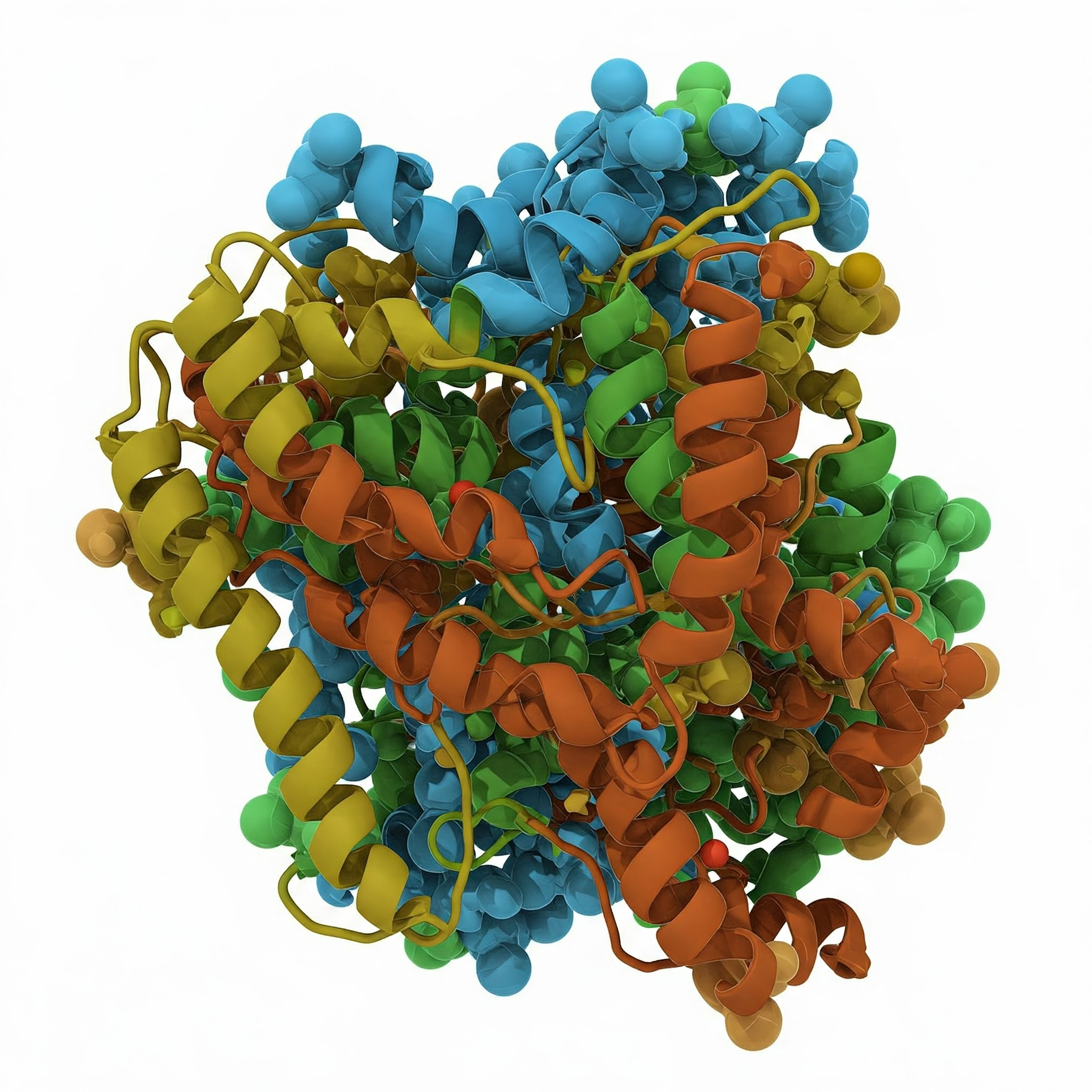
Students are facing new challenges in decoding biomolecular representations today, as the use of AI generated images has begun to infiltrate online study resources and even published scientific journals (Chawla, 2025). As we enter into the new era, students will need to develop an even more critical approach to deciphering whether the images they observe are even physically or biologically possible. An example of an image produced by Google Gemini in response to the prompt “generate an image of a three dimensional protein containing helices and beta-sheets, with a white background” is shown in Figure 8. While some aspects of the image are accurate, for example the presence of right-handed helices, several features of the image are inconsistent with appropriate representations, notably the integration of both cartoon and ball-and-stick models and the overly close association of helices. Students are likely to be exposed to AI images in online study materials and even journal articles, and therefore need to be taught the skills to identify these misleading images.